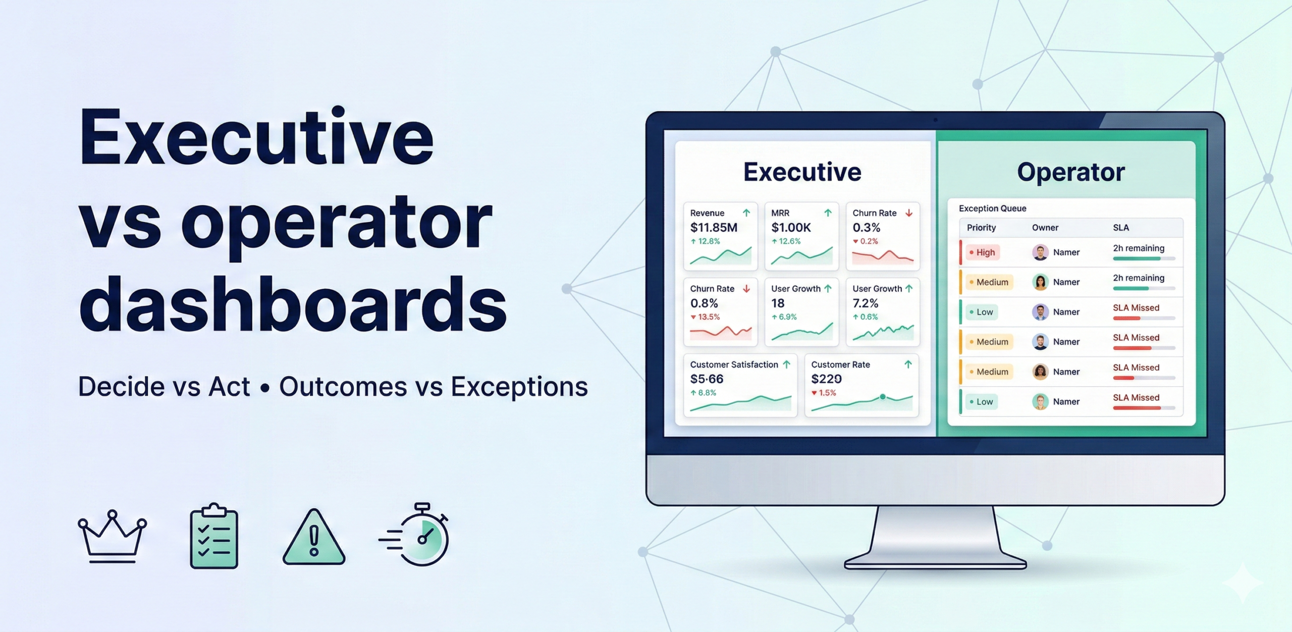
Executive dashboards are built to decide (outcomes, drivers, trend, risk). Operator dashboards are built to act (exceptions, priorities, owners, SLAs). Most dashboards fail because they try to serve both audiences with a single view—resulting in noise for executives and no clarity on actions for operators.
The design rules
The design of each dashboard type flows directly from its purpose. Because the two audiences have fundamentally different jobs—one decides direction, the other executes it—the rules that govern their dashboards are almost mirror images of each other. Applying operator-dashboard thinking to an executive view (or vice versa) is the single most common reason dashboards go unused.
Executive dashboard rules (8–12 KPIs max)
Executives scan for signal, not detail. Every design choice should reduce cognitive load and surface the information needed to make a resource, priority, or strategic decision—nothing more.
- Outcomes vs target — Every KPI on an executive dashboard must show the current value alongside a clearly defined target or benchmark. Without the target, a number has no meaning: revenue of $4.2M is good news if the target was $4M and bad news if it was $5M. The target should be the agreed business goal—annual plan, quarterly OKR, or industry benchmark—not a statistical average, which tells the executive what is normal rather than what is required.
- 2–3 drivers per outcome — For each headline outcome KPI, surface the two or three leading indicators that most directly explain its movement. If revenue is the outcome, the drivers might be new logo count, average deal size, and churn rate. This gives the executive an immediate explanatory layer—they can see not just that revenue is below target but which lever is responsible—without turning the dashboard into a full analytical model. More than three drivers per outcome creates the same noise problem as having too many KPIs overall.
- Trend + risk band — Showing a single current value without trend context is like reading one sentence from the middle of a report. Include a sparkline or mini-trend for each KPI covering the last 4–8 periods so the executive can immediately see whether the metric is improving, stable, or deteriorating. The risk band (typically a shaded zone representing the warning and breach thresholds) adds a visual reference for how close the current value is to a problem state, enabling faster assessment than reading a number and recalling the threshold from memory.
- Narrative (what changed and why) — Numbers without context force interpretation: the executive has to construct the story themselves, often incorrectly. A one- or two-sentence automated or analyst-written narrative attached to each significant movement—”Gross margin declined 1.2 pp vs last month, driven by a 3% increase in logistics costs in the APAC region”—eliminates this guesswork and makes the dashboard self-contained. The narrative should explain the change, not just restate the number. This is the feature that most directly reduces the volume of follow-up questions executives send to the data team after each review.
- Minimal slicers — Executive dashboards should offer at most one or two filter controls—typically time period and business unit or region—because executives are looking for the synthesised view, not the raw data. Every additional slicer is an invitation for the executive to drill into operational detail, which is exactly what operator dashboards are for. Excessive interactivity also creates inconsistency: two executives who apply different filters will reach different conclusions and then debate the data in a meeting instead of the business problem.
Operator dashboard rules (exception-first)
Operators need to know what requires attention right now, in what order, who is responsible, and what they should do next. Every design choice should support the “work the queue” rhythm—open the dashboard, see your exceptions, act on the highest-priority ones, close them out.
- A prioritized action queue — The default view of an operator dashboard is not a summary of all metrics but a ranked list of the things that are currently wrong, ordered by priority (impact × urgency). Items that require immediate action appear at the top; items that can wait appear lower. A clean queue with 3–7 items is far more actionable than a dashboard with 40 charts, because the operator does not have to interpret the data—they just work the list from top to bottom. The queue should be dynamic: resolved exceptions drop off automatically and new ones appear as they breach thresholds.
- Owner + SLA + next step — Each item in the queue must carry three pieces of operational metadata: the name of the person accountable for resolving it, the SLA deadline (how many hours or days remain), and a suggested or required next step. The next step removes ambiguity about what “resolving this” actually means—is it escalating to a supplier, contacting a customer, re-running a job, or calling a carrier? Without this, each operator spends time figuring out the process before they can start acting, which multiplies response time across every exception.
- Drilldown path to root cause — Exceptions should link directly to the supporting detail that explains the cause: the specific SKUs driving a stockout, the routes behind a delivery delay, the accounts contributing to a cost variance. The drilldown must be pre-scoped to the exception—not a link to a general overview dashboard where the operator must re-apply filters. The test of a good drilldown is whether an operator can get from “there is a problem” to “I understand what is causing it” in under two minutes without leaving the dashboard environment.
- Only operational levers (what can be changed) — Operator dashboards should only display metrics and dimensions that the operator can directly influence. Showing an operator a revenue-vs-budget figure that depends on strategic pricing decisions they do not control creates frustration and erodes trust in the dashboard. Restrict the view to the inputs the operator owns: fulfilment rates, response times, stock levels, cost codes—whatever falls within their authority to act on. Metrics outside their control belong on the executive dashboard, not here.
What changes (comparison table)
The table below summarises the five key dimensions on which the two dashboard types differ. Use it as a quick reference when scoping a new dashboard to ensure the design choices are aligned with the intended audience—and as a diagnostic tool when an existing dashboard is underperforming, since misalignment on any single dimension is often the root cause.
| Dimension | Executive view | Operator view |
| Purpose | Decide | Act |
| Horizon | Weekly/monthly | Daily/weekly |
| KPI type | Outcomes + drivers | Exceptions + levers |
| UX | Summary + trend | Queue + drilldown |
| Output | Decisions | Actions |
The action queue template (paste into your dashboard spec)
Use this column structure as the specification for your operator dashboard’s exception queue. Each column serves a specific purpose in the “work the queue” workflow—removing any one of them forces the operator to hunt for the missing information elsewhere, which breaks the rhythm. Include all seven columns in v1 and resist requests to add more without removing others; the value of the queue comes from its simplicity.
Columns:
- Exception name — A short, plain-language label describing what has breached its threshold (e.g., “Stockout risk — APAC SKUs” or “Delivery delay rate — North region”). The name should be specific enough that the operator immediately understands which part of the operation is affected, without needing to click through for context.
- Impact estimate (₹ / hours / risk) — A quantified estimate of the business cost of the exception if it is not resolved within the SLA: revenue at risk, operational hours lost, number of customers affected, or a qualitative risk rating if a financial figure cannot be calculated. This column is what makes priority scoring credible—operators can see why item #1 outranks item #3, and it gives them the business case for escalating to management when they need additional resources to act.
- Priority score (Impact × Urgency) — A single numeric score that ranks the exception relative to all others currently in the queue. Calculated by multiplying the impact rating by the urgency rating (how quickly the situation will worsen if left unaddressed). The queue is sorted by this score in descending order so the operator always sees the most critical item first and does not have to exercise judgement about what to work on next.
- Owner — The single named person accountable for resolving this exception. Not a team, not a role—a person. The owner receives the SLA notification and is the one whose name appears in the escalation if the exception is not resolved on time. Pre-assigning ownership at the point of dashboard design (not reactively when an exception fires) eliminates the most common cause of SLA breaches: the delay between an exception appearing and someone accepting responsibility for it.
- SLA / due date — The absolute deadline by which the exception must be resolved or formally escalated, shown as a date-time and a countdown (e.g., “Due 14:00 today — 3h remaining”). As the deadline approaches, the row should be visually flagged (amber at 50% elapsed, red at 80% or past due) to create urgency without requiring the operator to calculate time remaining manually.
- Suggested next action — A brief, prescribed instruction for what the owner should do first: “Contact supplier X to confirm replenishment ETA,” “Re-route shipments via carrier Y,” “Review cost codes 4510–4520 for miscoding.” This is not a substitute for the owner’s judgment but a starting point that eliminates the blank-page problem and ensures consistent responses across shifts, regions, and individuals. For complex exceptions, it can be a link to a standard operating procedure.
- Drill link — A direct hyperlink to the pre-scoped drilldown view for this specific exception—filtered to the relevant SKUs, routes, accounts, or time window. Clicking it should immediately show the supporting detail without requiring the operator to navigate, filter, or reconstruct the context. The drill link is the bridge between knowing there is a problem and understanding what is causing it.
MVP build (2–4 weeks)
This four-week plan builds both dashboard types from the same underlying KPI layer, which is critical: the executive and operator views should draw from the same data, not parallel datasets that diverge over time. The sequence builds the operational foundation first (weeks 1–2) and adds the executive layer on top (week 3), finishing with a calibration cycle (week 4).
- Week 1: define decisions, owners, thresholds — Run a scoping session with both the executive sponsor and the operator team leads. For executives, identify the 8–12 outcome KPIs and their 2–3 drivers. For operators, identify the 5–7 exceptions that matter most and agree the warning/breach thresholds, SLAs, and owners for each. Document both in a shared spec before any build work begins. Decisions made here will determine the quality of both dashboards—investing a full week in getting them right pays back immediately.
- Week 2: build operator exception queue + drilldowns — Build the exception queue view first because it is the higher-frequency, higher-urgency tool and its build process will surface data quality issues that would also affect the executive dashboard. For each exception, implement the threshold detection logic, wire up the action queue columns, and build or link the pre-scoped drilldown. Test the end-to-end path—threshold breach → queue entry → drilldown → root cause—with a real operator before moving to week 3.
- Week 3: build exec summary view (same KPI layer) — Build the executive dashboard drawing from the same semantic layer and certified KPI definitions used for the operator dashboard. Add trend sparklines, risk bands, and narrative annotations for each outcome KPI. Wire in the driver metrics below each outcome. The executive view should be read-only or near-read-only—limit slicers to time period and top-level business unit. Conduct a review session with the executive sponsor before launch to validate that the view answers their actual decision-making questions.
- Week 4: run 2 cadence cycles and tune thresholds — Run the operator queue review and the executive dashboard review twice each in week 4. Use these sessions to collect structured feedback: Are any exceptions firing too frequently (threshold too sensitive)? Are any genuine problems being missed (threshold too lenient)? Is the executive narrative accurate and useful? Adjust thresholds, priority scores, and narrative logic based on this feedback before the dashboards are declared production-ready and handed to the wider team.
Adoption metrics (measure this)
A dashboard that is technically correct but unused has no business value. These four metrics track whether the dashboards are actually driving the behaviours they were designed for. Review them monthly with the dashboard owner and treat a declining trend as a signal to investigate whether the content, design, or operating cadence needs adjustment—not whether the data needs reloading.
- Weekly active users (WAU) by role — Tracks the number of distinct users opening each dashboard at least once per week, broken down by executive vs operator role. WAU is the primary indicator of whether the dashboard has become part of the team’s operating rhythm or is being ignored. A healthy operator dashboard should show near-100% WAU among the owning team; an executive dashboard should show consistent usage in the week of each regular review cycle. A sudden WAU drop signals a loss of trust, a change in operating rhythm, or a data quality incident.
- Time-to-detect and time-to-act — Measures the average elapsed time between an exception breaching its threshold and (a) the owner viewing it in the dashboard (time-to-detect) and (b) the owner recording a first action or resolution (time-to-act). These two metrics quantify the operational value of the dashboard: the faster the detection and response, the more business impact the dashboard is delivering. Baseline both metrics in week 4 and set improvement targets for the following quarter.
- Exceptions closed per week — The total number of exception queue items resolved within their SLA in a rolling 7-day window. This is the throughput metric for the operator dashboard: it measures whether the “work the queue” operating rhythm is functioning. A low closure rate relative to the number of exceptions raised indicates either that thresholds are too sensitive (too many exceptions to handle), that SLAs are too tight, or that the team lacks the tools or authority to resolve the underlying issues.
- % of decisions supported by dashboard review — Tracks the proportion of significant business decisions made in the review period that were explicitly informed by a dashboard review—either documented in a meeting note or self-reported by the decision-maker in a brief monthly survey. This is the adoption metric for the executive dashboard. A high percentage confirms that the dashboard has become the starting point for strategic discussion rather than an optional reference. It also provides the business case for continued investment in the data and reporting infrastructure.