The fastest way to increase trust is to operationalize freshness and completeness first—because most “wrong dashboard” complaints are actually “stale or incomplete data.” Once those are stable, add anomaly detection and bias monitoring so issues are caught before leadership review.
The “Integrity KPI set” (copy-paste)
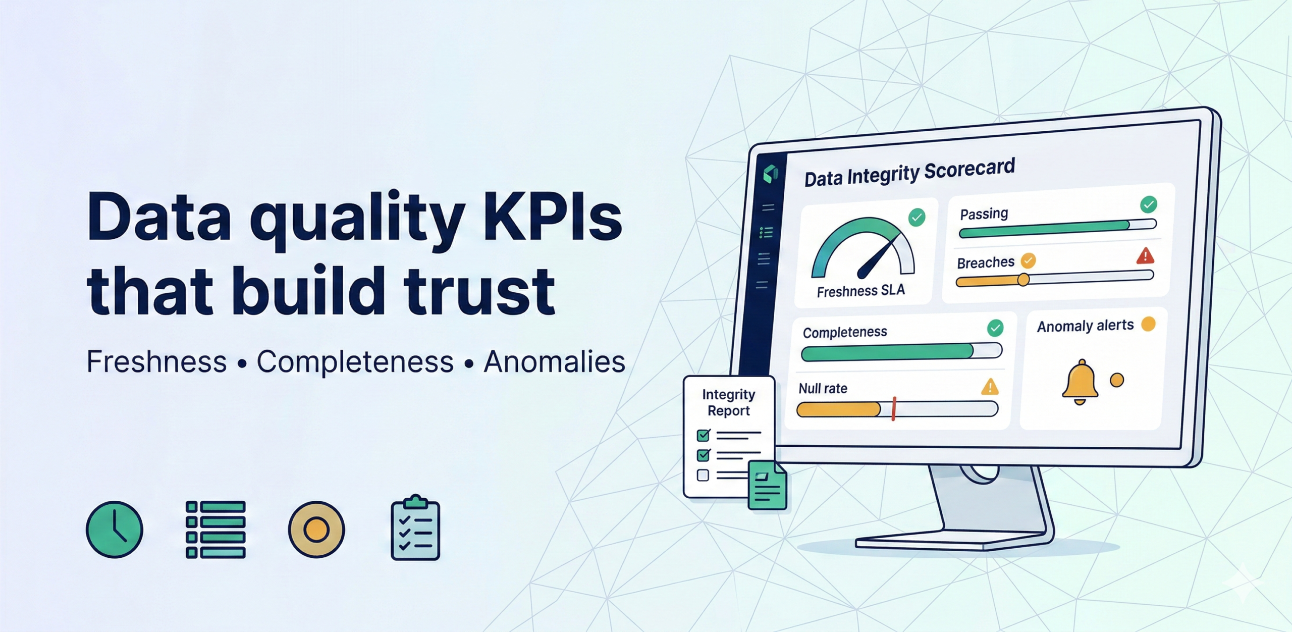
Tier 1 (must-have)
These four metrics form the baseline of any data trust program. They are easy to automate, directly visible to stakeholders, and responsible for the vast majority of trust failures. Implement them first—before anything else—because they deliver the fastest return on investment and give your team a shared language for data reliability.
- Freshness SLA compliance % — Measures what percentage of your data assets were updated within their agreed Service Level Agreement window. A Sales dashboard promised to refresh by 7 AM that still shows yesterday’s numbers by 9 AM is an SLA breach. Tracking this metric over time reveals which pipelines are chronically late, so you can prioritize engineering effort where it hurts most.
- Completeness % (record count / expected) — Compares the number of records actually loaded against the number you expected. If your e-commerce platform processes ~10,000 orders a day and only 6,000 land in the warehouse, something broke mid-pipeline. This ratio surfaces silent data loss that would otherwise pass unnoticed until a business review exposes the gap.
- Critical null rate (top fields) — Tracks the proportion of NULL or empty values in the fields that power key calculations—revenue, customer ID, product SKU. A spike in null rate on a join key can silently inflate or deflate every downstream metric that depends on it. Even a 2–3% increase in nulls on a critical column can produce materially wrong KPI totals.
- Pipeline failure rate + MTTR — Captures both how often pipelines fail and how quickly the team recovers. Mean Time to Recovery (MTTR) is just as important as failure rate: a pipeline that fails once a week but is fixed in 10 minutes causes far less business disruption than one that fails once a month but takes 6 hours to restore. Together, these two numbers define your operational reliability posture.
Tier 2 (high value)
Once Tier 1 is stable, these metrics add a layer of business-logic validation. They go beyond “did the data arrive?” to ask “does the data make sense?” They require a slightly deeper understanding of your domain, but they are the ones that prevent embarrassing errors from reaching the boardroom.
- Reconciliation checks for key totals — Compares aggregated figures across two authoritative sources to confirm they agree. For example, total revenue in the data warehouse should match the ERP system’s closing balance within a defined tolerance. Discrepancies flag either a transformation bug, a missing source feed, or a business logic mismatch—each of which needs a different fix.
- KPI anomaly flags (spikes/drops) — Uses statistical banding (e.g., ±2–3 standard deviations from a rolling baseline) to automatically flag unusual movements in headline KPIs. A 40% day-over-day drop in conversion rate could be a genuine business event—or a broken tracking pixel. Anomaly flags route the question to the right person before it surfaces in a leadership deck without context.
Tier 3 (for ML/forecasting)
If your organisation uses machine learning models or automated forecasts, data quality failures propagate silently into predictions. These metrics catch the upstream problems that cause model degradation long before the model’s output looks obviously wrong.
- Bias indicators (segment coverage drift) — Monitors whether certain customer segments, geographies, or product categories are becoming over- or under-represented in your training data over time. Coverage drift means the model is increasingly trained on a skewed slice of reality, which produces predictions that systematically favour or ignore certain groups—a risk both to business accuracy and to fairness compliance.
- Model input drift and forecast error drift — Input drift measures how much the statistical distribution of features fed into a model has shifted since training (e.g., average order value moving from $45 to $120). Forecast error drift tracks whether prediction accuracy is degrading over time. Both are early-warning signals that a model needs retraining before its outputs mislead automated decisions or executive forecasts.
SLA table template
Use the table below as a starting point. For each critical data asset, agree the expected refresh cadence with the owning team, set a realistic SLA window, and assign a named owner who will be paged when the SLA is breached. The escalation column ensures that unresolved breaches reach the right decision-maker without requiring manual triage.
| Asset | Expected refresh | Freshness SLA | Owner | Escalation |
| Sales fact | Daily 6 AM | ≤7 AM | DataOps | Ops lead |
| Inventory snapshot | Hourly | ≤90 min | DataOps | Supply lead |
MVP (3–4 weeks)
This four-week plan is designed for teams starting from near-zero observability. Each week has a clear, shippable deliverable so you can show progress to stakeholders and build momentum. The goal at the end of week four is a live dashboard, an alert system, and a recurring review ritual—enough to sustain trust in your data assets without a full data quality platform.
- Week 1: identify top 20 critical assets + owners — Audit which data assets feed the most important dashboards and decisions. For each asset, confirm who owns it, what its expected refresh schedule is, and where it sits in the pipeline. This exercise also surfaces undocumented dependencies and orphaned datasets that nobody actively maintains.
- Week 2: freshness + completeness checks + alert routing — Implement automated checks for the Tier 1 metrics on your top 20 assets. Route failures to the owning team via Slack or email so that broken pipelines are caught within minutes, not discovered by an analyst the next morning. Keep thresholds conservative at first—it is better to have a few reliable alerts than a flood of noise.
- Week 3: integrity report dashboard + weekly review cadence — Build a single-page dashboard that surfaces SLA compliance %, completeness %, critical null rates, and pipeline MTTR across all monitored assets. Establish a weekly 30-minute data quality review with the DataOps team and one business stakeholder to walk through the metrics and prioritise fixes.
- Week 4: add anomaly checks for top KPIs — Layer in statistical anomaly detection on your three to five most business-critical KPIs. Tune the sensitivity based on historical variance so alerts are actionable rather than noisy. By the end of this week, your team has a complete Tier 1 quality layer running in production.
Tests to include
These are the five core data quality tests every pipeline should have. They can be implemented in dbt, Great Expectations, Soda, or even plain SQL. Run them on every scheduled pipeline execution so failures are caught at the source, not discovered downstream.
- Freshness check (max timestamp) — Queries the maximum value of the pipeline’s load or event timestamp and asserts it falls within the expected SLA window. If the latest record is older than the threshold, the check fails and an alert fires. This is the single highest-impact test you can add to any pipeline in under five minutes.
- Completeness check (row count bands) — Asserts that the number of rows loaded into a table falls within an acceptable range (e.g., between 80% and 120% of the rolling 7-day average). This catches both partial loads (too few rows) and accidental duplications (too many rows) before they affect downstream consumers.
- Null rate thresholds — For each critical column, defines a maximum acceptable proportion of NULL values (e.g., customer_id must be non-null in ≥99% of rows). Any breach is a signal that an upstream source change, a bad join, or a schema migration has corrupted a field that downstream models depend on.
- Duplicate key detection — Checks that primary or business keys (e.g., order_id, user_id) are unique within a table. Duplicate keys cause inflated counts and incorrect aggregations everywhere downstream. They are one of the most common causes of “the numbers don’t add up” complaints and one of the easiest to detect automatically.
- KPI anomaly banding — Computes a rolling mean and standard deviation for each headline KPI and flags any value that falls outside a defined band (typically ±2σ). Unlike a hard threshold, anomaly banding adapts to seasonal patterns and long-term trends, reducing false positives while still catching genuine data quality events.